Tutorial
AIDO gives you access to two sources of data: fact sheets and outbreak records. This tutorial will briefly explain both of these sources and how to use them.
Overview
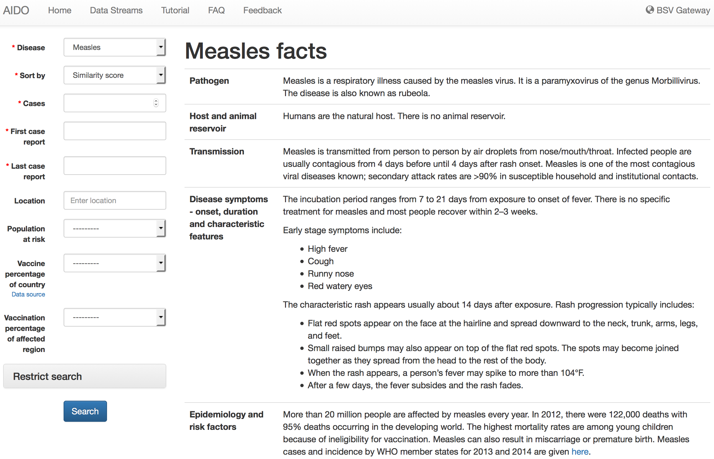
On the homepage, you will see a drop down list that displays the names of all diseases currently available in AIDO. Selecting a disease and clicking Search will pull up the disease's fact sheet and search form.
Every disease page in AIDO includes a fact sheet containing useful information about the given disease. To the left of this fact sheet, the disease's search form is displayed. For example, measles appears like this:
Searching outbreak records
AIDO can rank outbreak records based on user input, allowing users to quickly identify known historical outbreaks that are similar to a current or hypothetical outbreak.
To access the contextual search capability,
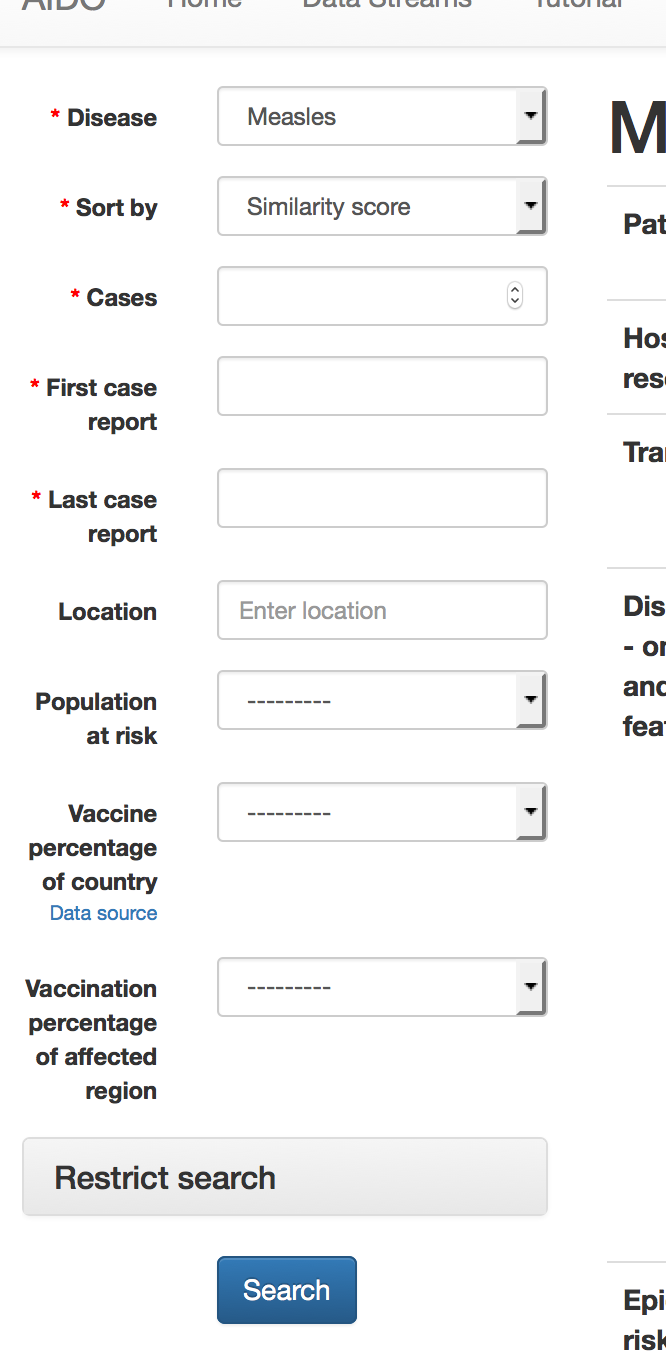
- Select Similarity score for the disease's Sort by dropdown box in the form to the left of the disease fact sheet.
- Fill in as many of the fields as possible. Some of the parameters include a Data source link; these sources can be helpful if you are unsure what to enter for a parameter.
- Click Search at the bottom of the form to bring up the outbreak records for the given disease, ranked from most similar to least similar.
Not dealing with a specific outbreak, but want to get a feel for what known historical outbreaks look like for a disease? Instead of sorting outbreaks by Similarity score, sort by Date or Distance from a location.
- Select Date or Distance from a location in the disease's Sort by dropbown box.
- Date doesn't require any further input; outbreaks will be sorted by their date, newest outbreaks first.
- Distance from a location requires the user to provide a location from which to measure distance to each outbreak.
Users can also filter results. For example, if you are only interested in measles outbreaks that occurred in the U.S., you can restrict your search to only those outbreaks.
- Select the appropriate Sort by option and fill in the necessary fields, as described above.
- Expand the Restrict search section. Fill out any fields for which you want to restrict the search.
Contents of an outbreak record
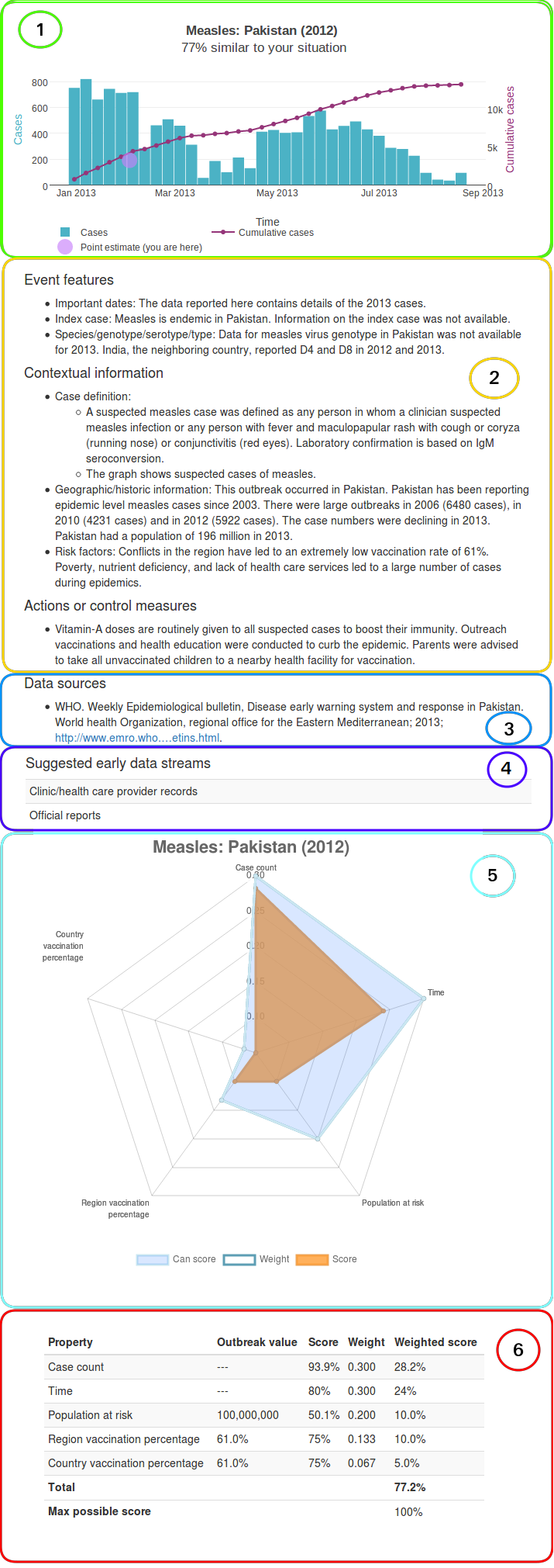
Each outbreak record shows the following:
- Historical data curve The actual historical epidemic curve is drawn. Additionally, if sorting by Similarity score, we place a point estimate from your data in the context of the historical outbreak. The point estimate is based on total cases, so it will be shown in purple and should be compared to the purple cumulative case count curve. Additionally, the similarity score is shown below the graph title. The score indicates how similar the provided user data is to the historical data. A breakdown of this score is available beneath the data streams section (see below).
- Outbreak factors Outbreak factors are points of possible interest from the historical outbreak. They help to contextualize the historical data and can help you, as an analyst, understand if your outbreak might be similar. Factors include items such as: geographic/historical information, risk factors, case definition, vector, species/genotype/serotype, and more.
- Data source We provide the source for the data in each outbreak.
- Suggested data streams These data streams are based on the data streams framework developed at LANL. They indicate when particular data streams were used in the historical outbreak, and may provide insight into data streams that could be utilized during an unfolding outbreak. See Data Streams for an exhaustive list with examples of data streams considered.
-
Score breakdown - radar chart Underneath the suggested data streams is an expandable table entitled How was this outbreak scored? This view shows exactly how the similarity score was calculated. The first section contains a radar chart, where each axis is one of the properties that was used when scoring the outbreak.
Three series are plotted on this radar chart:
Weight - The relative importance of each property in distinguishing outbreaks.
Score - The weighted score given to each property for this outbreak.
Can score - Indicates whether there was sufficient data to score the outbreak. This series provides a way to distinguish a true low score from a simple lack of data. If all the data are available for scoring, then each of the properties' can score values will be set to the property's weight. This will shade in the entire radar chart, showing that all properties were properly scored. If, however, the data for one of the properties is missing, both the score and can score values will be set to 0 for that property, indicating that it could not be scored correctly.
- Score breakdown - score table This table shows exactly how the similarity score was computed. For each property considered, the outbreak value, maximum score, weight (i.e., relative importance based on our analyses), and weighted score are all shown. The table's total score is equivalent to the similarity score shown under the graph title.
Additional features
-
The
 button can be found in the top right corner of each graph in AIDO. This button allows you to save the historical graph as an image.
- By clicking on any of the items in the graph legend (located under the graph), you can modify what is shown in the graph to better fit your needs.