Frequently asked questions (FAQ)
- What is the scope of AIDO?
- How can I filter out outbreaks I know are irrelevant?
- How are the data in AIDO collected?
- What are the assumptions, caveats, and limiting factors?
- Can I get access to the raw outbreak time series in AIDO?
- How are outbreak similarity scores computed?
- How is the point estimate computed?
- How is the short-term forecast generated?
- How are empty values handled when computing the similarity score?
- A data source link is broken. How can I access the original data source?
- Why was the name of this tool changed from SWAP to AIDO?
- How were AIDO's algorithms evaluated?
- What are the BRD links used for?
- Why do some diseases have the similarity score feature disabled?
- In the AIDO library, who determines when an outbreak has occurred?
- How should I use the "Anomaly detection" section?
What is the scope of AIDO?
How can I filter out outbreaks I know are irrelevant?
How are the data in AIDO collected?
What are the assumptions, caveats, and limiting factors?
Assumptions
The reports provided by AIDO are summaries of reports from other organizations. Because of this, our data can only be as accurate as the reports they are based on. Therefore, an assumption of AIDO is that the reports provided by health organizations are relatively complete and accurate. Every outbreak listed in AIDO provides references to the original outbreak reports.
Caveats
The AIDO similarity function provides a weighted mean comparing user input to a library of historic disease outbreaks, based on properties identified by literature and analysts as important to disease progression. The point estimate placed by the similarity algorithm in AIDO is a tool to contextualize user data and should not be treated as a forecast.
Our similarity algorithm relies on the user’s ability to complete the form associated with their outbreak. When possible we provide data sources from which additional information can be collected. However, if a user cannot provide property information, the associated similarity score will necessarily be lower (see the "How are empty values handled when computing the similarity score?" FAQ entry for more information). The more information a user can provide, the more accurate the algorithm will be.
Limiting factors
Because the AIDO similarity function compares user data to a library of historic outbreaks, similarity scores rely heavily on the types and quality of the data in the libraries. We strive to provide libraries that are richly diverse and from reports with good quality data. However, the number of outbreaks per library varies substantially between diseases based on data availability.
Can I get access to the raw outbreak time series in AIDO?
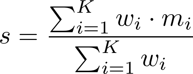
How are outbreak similarity scores computed?
When a user submits the form to match an outbreak to their situation, we compute a score for each outbreak in our library. This score represents how similar, on a scale from 0 to 100, the outbreak is to the user's situation. This allows the user to understand their situation in the context of historical outbreaks.
Scores are generated using a simple weighted sum,
 ,
,
such that 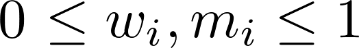 and
and 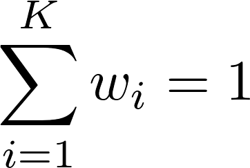 , which ensure that
 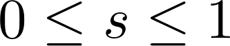 .
.
Here, s is the outbreak's similarity score, K is the number of properties considered, wi is the weight of property i, and mi is the outbreak's match score of property i (i.e., how well the outbreak's value for property i matches the user's value, provided in the query form).
Note that while the equation above returns a score, s, between 0 and 1, we display scores as percentages (i.e., we display s · 100).
Selecting disease properties and tuning the property weights is done in several steps:
- Analysts build an outbreak library for the disease. The library contains time series, location data, source references, and any notable factors that influenced the outbreak's progression. The size of the library will depend on a variety of factors (e.g., how pervasive the disease is, the quality and availability of the reported data, whether the disease requires mandatory reporting).
- Properties that influence outbreak progression are determined by the analyst. Some examples of these properties include: location, total population at risk, strain, socioeconomic factors, and contamination source.
- Property importance is ranked based on a sensitivity analysis. The ranking orders properties by how influential they are when distinguishing outbreaks.
- Property weights are assigned from the rankings using the rank-sum method. For example, a weight of 0.25 assigned to the location property means that 25% of each outbreak's total score is determined by the proximity of the location in the user's query to the outbreak's location.
During the development of the matching algorithm, the first classification of outbreaks in our analysis occurs by size and duration. Other properties are selected based on their ability to sort by case count and/or duration. As a result, the "Case count" and "Time" properties will always receive the highest weights.
For more information on the weights various properties take on, including the maximum possible score for an outbreak, please view the "How was this outbreak scored?" table below each outbreak chart.
How is the point estimate computed?
When a user sorts results by similarity score, a point estimate is shown on each resulting graph. This point estimate is drawn based on the user's input relative to the outbreak start date in each disease curve. The point estimate appears as a circle on top of the graph:
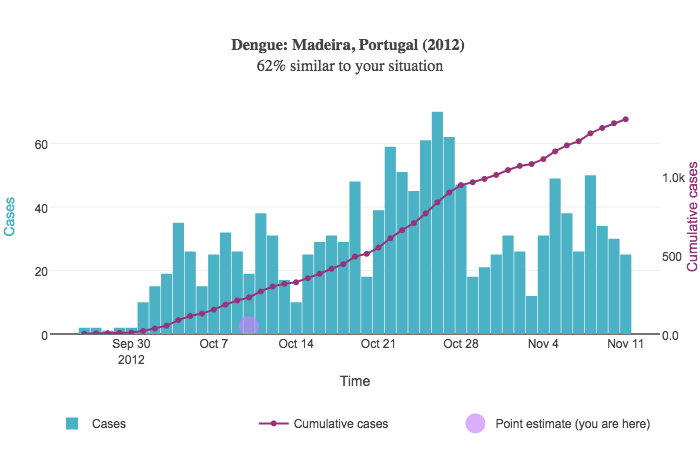
Suppose the user inputs 50 cases of dengue between 2015-05-05 and 2015-05-19. In other words, there were 50 cumulative cases over a two-week period of time.
In the above example, the outbreak began September 25, 2012. We compute the date two weeks after this initial date; this is October 9. This date is used for the point estimate's X coordinate. The Y coordinate is drawn relative to the right Y axis representing the cumulative case count and is simply the number of cases the user provides; in this case, the Y coordinate is 50.
How is the short-term forecast generated?
The short-term forecast is generated using a simplified variation on an algorithm called the method of analogs. The method of analogs is a simple forecasting method that relies on a large library of historical information. It has applications in fields such as meteorology, climatology, and epidemiology.
When a user sorts results by similarity score, a short-term forecast graph is displayed at the top of the sorted outbreak results. This graph presents a simple custom forecast of cumulative disease incidence based on user input and our library of historical outbreak curves. An example forecast is shown below.
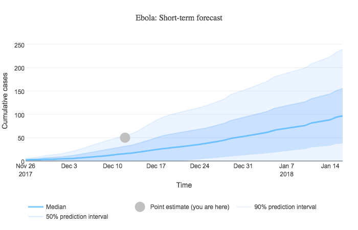
Algorithm
- Select the 10 highest-scoring (most similar to the user’s input) outbreaks that have a similarity score greater than 50%.
- Line cumulative case count curves up in time and group by time unit:
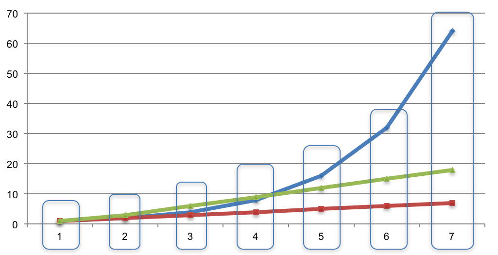
- For each time unit, we have a list of case counts. Compute the mean and standard deviation to fit a normal distribution. For example, if the case counts at a certain time point are [14, 23, 56, 19, 12], then μ = 24.8 and σ = 16.07.
- Using this normal distribution, we can compute the median, 50% prediction interval, and 90% prediction interval for each time unit. Case counts below zero don't make sense, so we institute a lower bound of zero. The normal distribution for the example case count values above produces median = 24.8, 50% PI = (13.96, 35.64), and 90% PI = (-1.63, 51.23) → (0, 51.23).
Notes
- Even though the graph may show several months' or years' worth of data, the method of analogs algorithm is generally only appropriate for short-term forecasting.
- To customize the forecast to the user, each case count is weighted in proportion to its outbreak similarity score; thus, case counts in outbreaks that are scored higher weigh more than case counts in outbreaks that are scored lower. To achieve this, we compute weighted mean and standard deviation values, which are then used as the normal distribution's parameters.
- The method of analogs is purely a statistical method. It does not not explicitly factor in any biological or epidemiological phenomena. However, because the similarity score is used to compute a weighted normal distribution, this means all considered properties are factored into the method of analogs implicitly. In other words, the method of analogs does not explicitly consider, for example, vaccination coverage or physician density or any other biologically- or epidemiologically-relevant property.
- If necessary, we will use Piecewise Cubic Hermite Interpolating Polynomial (PCHIP) interpolation to handle time series interval granularity issues. For example, if we have monthly and weekly data, PCHIP interpolation will be used to fill in the gaps in the monthly data so that it can be used alongside the weekly data. We interpolate at the finest resolution present in each outbreak library.
References
- C. Viboud, P.-Y. Boëlle, F. Carrat, A.-J. Valleron, and A. Flahault, "Prediction of the Spread of Influenza Epidemics by the Method of Analogues," American Journal of Epidemiology, vol. 158, no. 10, pp. 996–1006, 2003. Link.
- A. S. Mandel', "Method of Analogs in Prediction of Short Time Series: An Expert-statistical Approach," Automation and Remote Control, vol. 65, no. 4, pp. 634–641, 2004. Link.
- E. F. Vasechkina and V. D. Yarin, "Prediction of time series by the method of analogs," Physical Oceanography, vol. 17, no. 4, pp. 242–251, 2007. Link.
How are empty values handled when computing the similarity score?
There are two types of empty values that may be possible:
- The user may choose to leave certain questions blank. With the exception of the "Case count", "First case report", and "Last case report" fields (denoted mandatory by *), all questions on all outbreak match forms are optional to allow users the ability to leave questions blank that they may not have the answer to. For example, the measles match form asks users to provide the percentage of population vaccinated in the country and in the affected region. It is straightforward to determine the country's vaccine percentage using the provided data source link, but it may not be possible for the region. AIDO allows users to ignore such questions by leaving the answer blank (in this case, leaving the dropdown box selection on "---------").
- We may not have enough information to answer that question for a particular outbreak. For example, perhaps the strain of a specific small novel influenza outbreak wasn't determined or available in the available literature.
In both situations, empty values are handled in AIDO's weighting algorithm by reducing the outbreak's maximum possible score by the weight of the property that has the empty value. That is, the weight of the property—wi—is still factored into the weighted sum equation, but the match score for the property—m(pi)—will automatically be assigned 0.
Why
The reason we decrease the maximum possible score is so that the user recognizes the fact that missing data will decrease AIDO's ability to match outbreaks.
Example
If the user answers all questions, the maximum possible score will be 100%. Suppose, however, that the user leaves the location field blank, and suppose that the location property's weight is 0.25. This means that the maximum possible score that any outbreak can have is 75%.
Because there are two types of possible empty values, outbreaks may have differing max scores during a search. Using the above example, if the user leaves the location score blank, the max score any outbreak may have is 75%. However, suppose that one outbreak's strain is unknown; furthermore, suppose that the strain property's weight is 0.12. Because the user left the location score blank and the outbreak's strain is unknown, the maximum possible score for that particular outbreak will be 63%; the rest of the outbreaks that do have the strain property will have a maximum possible score of 75%.
For more information on the weights various properties take on, including the maximum possible score for an outbreak, please view the "How was this outbreak scored?" table below each outbreak chart.
A data source link is broken. How can I access the original data source?
Why was the name of this tool changed from SWAP to AIDO?
This tool was originally named SWAP (Surveillance Window Application) until mid-2016. We decided to change the name to AIDO (Analytics for Investigation of Disease Outbreaks) for several reasons:
- The scope of the tool has expanded beyond the "surveillance window" concept and offers more functionality/features, such as outbreak matching, investigation for a causative agent, and short-term forecasting.
- Having the word "app" or "application" in the named was confusing for some.
- AIDO better describes the goal and use of this tool.
We pronounce AIDO as "I do" or "I dough".
How were AIDO's algorithms evaluated?
We conducted two tests to evaluate the algorithm for each of the diseases:
- Test 1: Properties of an outbreak from the library were used as input, and AIDO was expected to return results with match scores of 95% or higher. This allowed us to correct possible errors in property values, time steps, and/or weight calculations.
- Test 2: Data from new outbreaks that were not included in the library were used as input. The top matches from AIDO results were then evaluated for their ability to match the expected case count and duration of the test outbreak. For this test, we collected outbreaks with complete epidemiological information as well as ongoing outbreaks with limited information. The matching scores were also evaluated for a reasonable cut off recommendation (i.e., similarity score thresholds below which matches may not be relevant). Our analyses showed that a lower limit of 65-70% provides a relevant match between an unfolding situation and a historical outbreak.
A document showing user input information for test outbreaks for all of the AIDO diseases along with the evaluation results is provided here.
What are the BRD links used for?
Why do some diseases have the similarity score feature disabled?
AIDO's analytical capabilities require a certain amount of data to be able to function reliably. The similarity score feature must be disabled for diseases that do not meet the data requirements.
If the "sort by similarity score" option is not available, it is probably due to an insufficient number of outbreaks. If you know of an outbreak that isn't listed in our library, please feel free to contact us to let us know.
In the AIDO library, who determines when an outbreak has occurred?
How should I use the "Anomaly detection" section?
Given the breadth and depth of AIDO's outbreak library, a user might wonder if their outbreak is anomalous compared to historical outbreaks. The "Anomaly detection" section is aimed at allowing the user to answer this question.
When viewing search results, outbreak properties (e.g., average daily cases, vaccination percentage, HDI) are broken up into two groups: 1) discrete and 2) continuous. Discrete properties are those for which there are a finite number of choices; for example, a "yes or no" question would be a discrete property. A continuous property is one for which a raw numerical value is provided; for example, the outbreak's total case count is a continuous property.
Charts showing the distribution of property values in AIDO are shown at the top of the search results page under the "Anomaly detection" tab. As discussed below, continuous property values are presented as box plots, and discrete property values are presented as pie charts. In both cases, a drop-down menu below the chart allows the user to select the property they wish to visualize.
Continuous properties
To visualize the distribution of values for a continuous property, a box plot is shown. If the user is sorting results by "Similarity score", the user's value, if provided, will be overlaid on the distribution of values in AIDO's library. The following screenshot shows a sample continuous property, total cases:
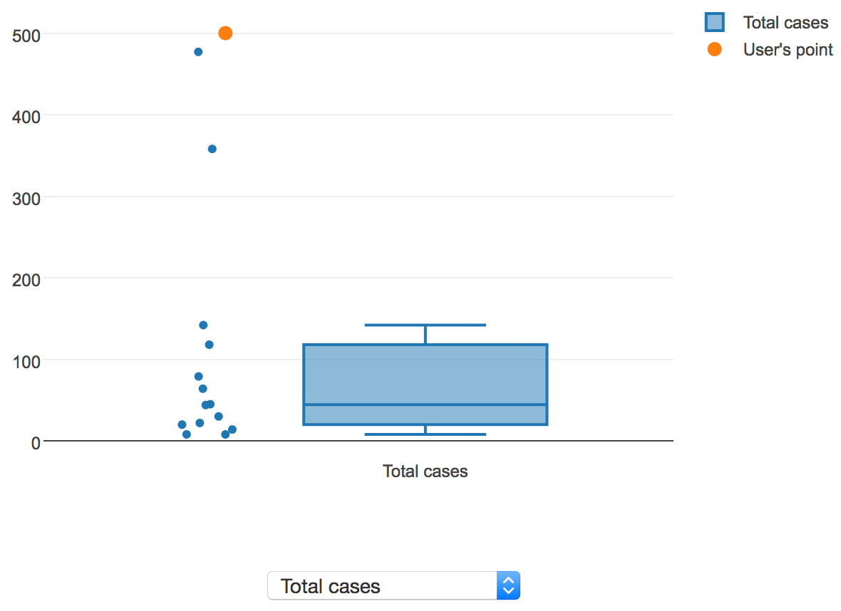
Here, the user's value is displayed in orange, and the values for all of the outbreaks in AIDO are displayed in blue, along with a box plot showing the median, 1st and 3rd quartiles, and lower and upper fence values. In this instance, the user's total case count value is clearly an outlier in the context of the historical outbreaks present in AIDO's library, which may be a cause for concern.
Discrete properties
To visualize the distribution of values for a discrete property, a pie chart is shown. If the user is sorting results by "Similarity score", the user's value, if provided, will be highlighted by darkening the border on the relevant pie slice. The following screenshot shows a sample discrete property, anthrax type:
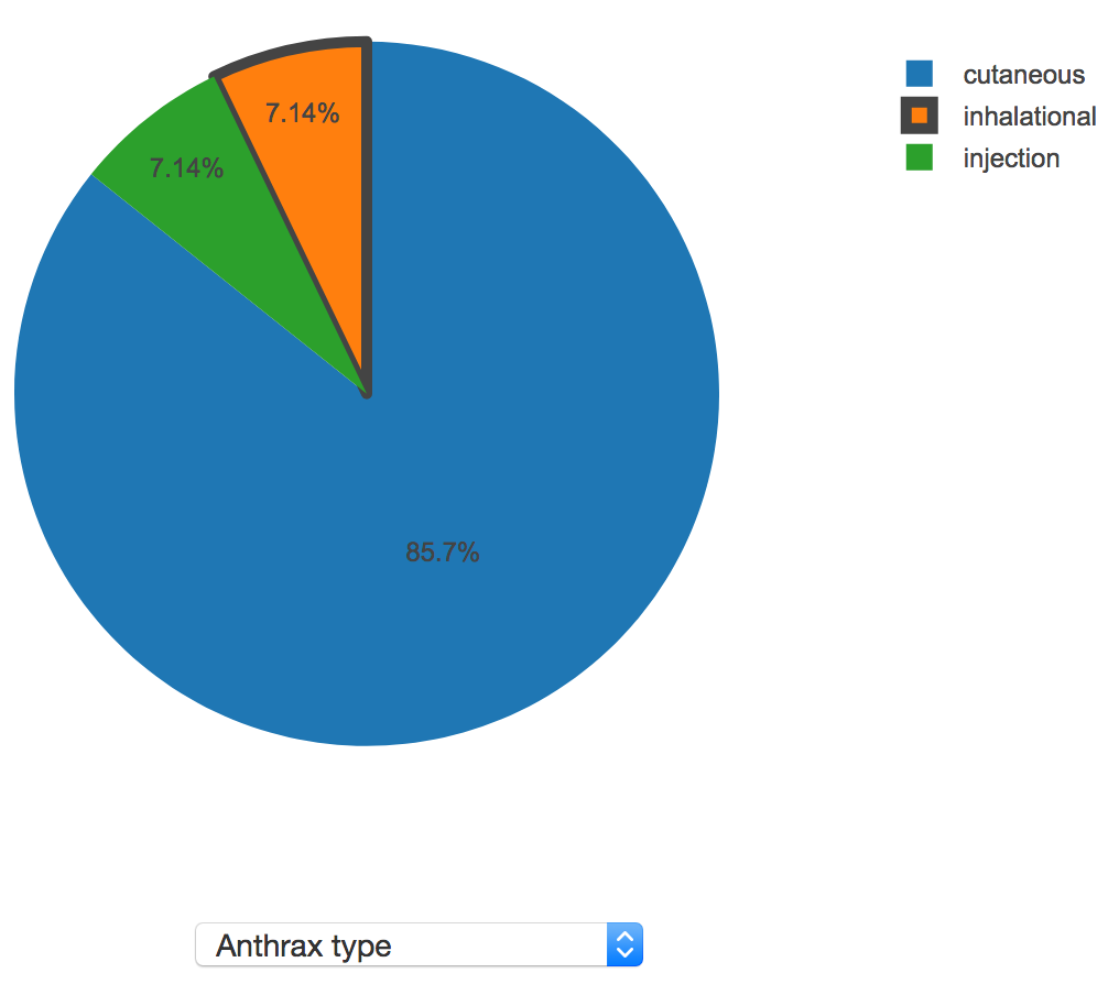
Here, the user's value was "inhalational", so that pie slice is highlighted. In this instance, inhalational anthrax only accounts for 7.14% of the anthrax outbreaks present in AIDO's library, so this may be a cause for concern.