Analytics for Investigation of Disease Outbreaks
AIDO is a decision-support tool designed to enhance situational awareness during unfolding disease outbreaks by providing the user with detailed background information on historical outbreaks.
Composed of over 650 outbreaks across a wide variety of diseases, the goal of AIDO is to give the user a representative sample of how outbreaks of different diseases progress under various circumstances.
This tool was previously known as the SWAP (Surveillance Window Application).
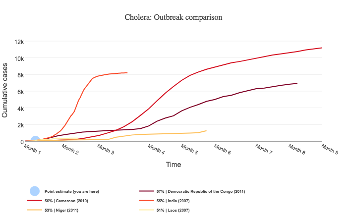
Outbreak comparison
AIDO offers a simple interface for viewing and interacting with a substantial outbreak library spanning many diseases. Users are able to search across this library to find outbreaks similar to what they are facing, allowing them to quickly identify historical outbreaks that may be significant to the ongoing event.
Click here for an overview the data our outbreaks include.
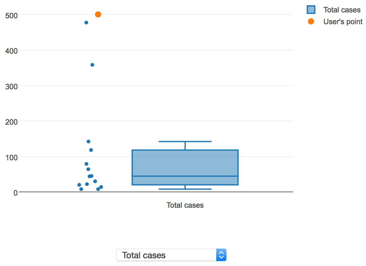
Anomalous outbreak detection
Given the breadth and depth of AIDO's outbreak library, a user might wonder if their outbreak is anomalous compared to historical outbreaks. The "Anomaly detection" section is aimed at allowing the user to answer this question. Box plots and pie charts are shown to provide the distribution of continuous and discrete properties, respectively.
Click here for more information.
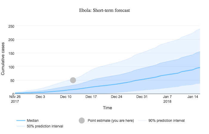
Short-term forecast
In addition to the library of historical outbreaks, AIDO includes a forecasting feature that makes use of the method of analogs algorithm. This algorithm uses the data collected for each outbreak in the selected disease to make a simple forecast of cumulative disease incidence.
Click here for more information.
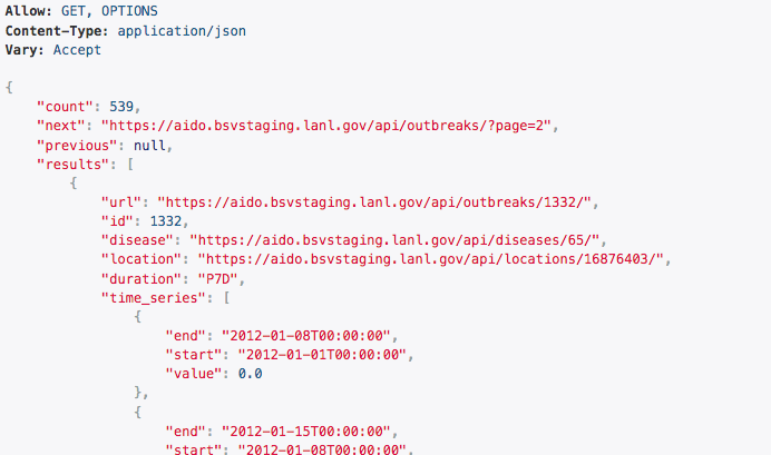
Outbreak time series
Each outbreak in AIDO provides detailed information on how the outbreak progressed under those circumstances. All outbreak records display an interactive time series and are annotated with contextual information.
Click here for more information.
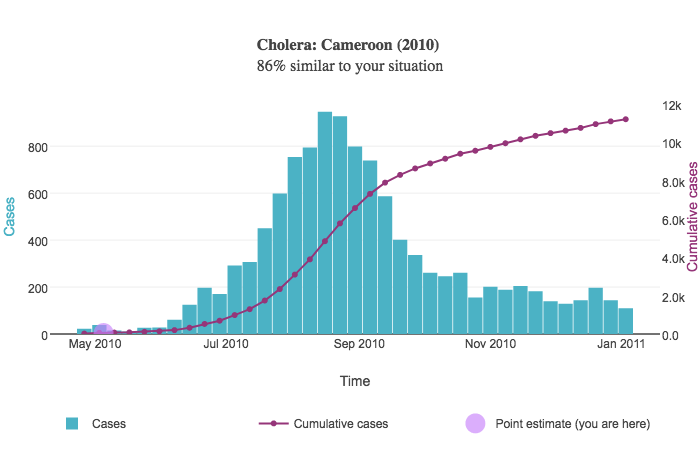
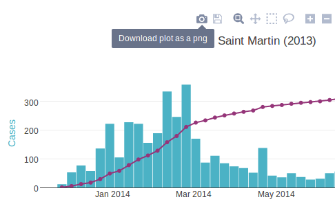
Chart export
AIDO provides visualizations for much of the data it uses. All plots displayed in AIDO can be quickly downloaded in various formats, allowing them to be easily included in reports.
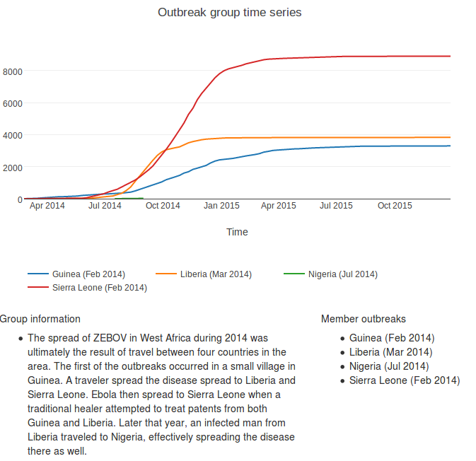
Outbreak groups
AIDO includes several major outbreaks that spread across multiple regions. The reports from each of these regions have been collected and added to AIDO, making it easy for users to gather data from the different governments and organizations that monitored the separate locations involved in the outbreak.